Desperate for…paint colors?
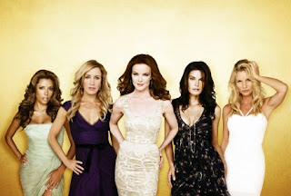
With all of the drama continually happening on the hit show Desperate Housewives, it is almost impossible to notice anything other than the catfights, marital drama, and murderous plots. Who ever thought to notice paint colors? Well, that person is me- as it seems I don’t have anything better to do since the writer’s strike is STILL going on and all of our shows are on repeats! Blogging has recently become a larger part of my life with my decrease in television watching and what better topic to focus on than the Desperate Housewives’ set!
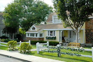
Tom Walsh is the genius Production Designer involved in choosing the paint colors for Wisteria Lane. All are Benjamin Moore colors- you will be happy to know- as these are widely accessible and very durable. Tom feels that you should tell the character’s stories through their environments and that’s why he carefully chose paint colors to reflect each of their different personalities.
All of the houses incorporate Ben Moore’s Whisper Violet 2070-70 for their trim and picket fences to make the setting “clean, bright and ideal”. They used a hint of violet on all of the conventionally white trim since the show is in fact set on ‘Wisteria’ Lane.
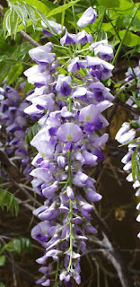
Wisteria flower
Nothing is too detailed in the homes due to the characters’ hectic lives. The producers did not want any distractions from them. Color is used in character association- each of the characters in the show having their own distinctive palette (the majority of which are soft and muted)
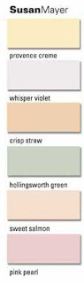
Susan Mayer– works from home as an illustrator- they used mostly soft pastel colors for her house to signify her sensitive, creative, and colorful personality.
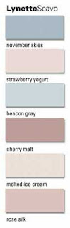
Lynette Scavo– Busy working mother with a hectic life raising four young boys. She is the only desperate housewife to get deep blue in her scheme- perhaps because of her house full of boys?

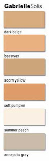
Gabrielle Solis– Former model with no kids- living a glamourous but deviant lifestyle. They gave her the warmest color scheme. Signifies her Hispanic Catholic background. The pumpkin shade in her Living Room suggests her fiery personality and unfaithful history with men.
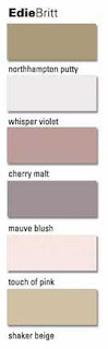
Edie Britt– Couldn’t find a single photo of her house online (could be because it burnt down last season!) but here are the paint colors for Edie’s home. Edie is your girly girl always wearing tiny dresses and trying to seduce the neighbors so I’m sure this is why her color palette stays feminine, sultry, and seductive. This is my favorite palette!
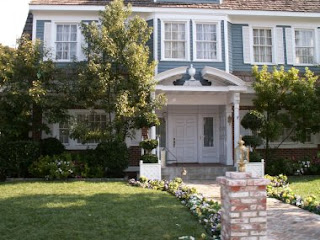
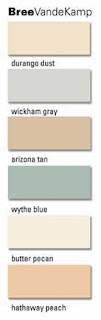
Bree VandeKamp– Bree is known as a bit of a perfectionist. It’s no surprise that her color scheme is very calming and is nothing too bold. Her simple “pretty” colors echos Bree’s personality to a tee. The wythe blue is a color that would make her fiery red hair pop on the set!

