Winter White
White is so calming, fresh, clean, and crisp looking. You’d think choosing a white paint color for your trim, walls or ceiling would be an easy task (much easier than choosing a color-color like blue or red, right?) Wrong! Talk about an urban myth! White is definitely one of the hardest paint colors to choose. There are some whites that yield more gray undertones and other whites that have more pink to them…some even have a tad bit of yellow! One thing I know for sure is that I like to choose whites that have a bit of a kick to them- I never choose just a plain stark white for walls. My whites tend to have some sort of undertone to them..I love creamy whites!

When you put a light color like cream on walls, it can indeed make a room feel much larger. So when you paint walls, moulding, and ceiling all the same shade of off white, it really does open up the room quite a bit and makes the space feel more airy.

I go back and forth a lot with color: sometimes I think that I would much rather have a really bold room that makes an intense statement; other times I wish I had an all white calming room in which the art gives the room its “wow” factor. What color of paint do you usually flock to? The calming creams or the bold/dark paint colors?

This bedroom feels very light and spacious. A natural rug in a darker neutral grounds the space and keeps all the white accents from floating away!

A white bedroom fit for a modern day princess!


Mostly creams in this living room…a few darker pieces help to balance out all of the light furniture.

We can’t get enough of white on white kitchens! And neither can anyone else it seems like! That seems to be the new trend these days…white carrara marble countertop, white subway tile backsplash, and white cabinets! A darker floor helps to set off the white cabinets and make them more distinct!

I absolutely adore this breakfast area and kitchen! White on white on white. Pink and cream flowers and a bunch of decorative plates add some color to this neutral room.

Just lovely! This Living Room stays formal and elegant with cream hues and gold accents

As we keep saying, a lot of the times it is a good idea to balance the light with a bit of dark. A sleek, dark based dining set and glamorous mirror work well with the curvaceous, more traditional chandelier and white palette.

A little bit darker of a cream color here; however, this bedroom still stays nice and soft. I have always thought the artwork in the middle of the two sconces was so fantastic- and all it is, is a sketch of a face on an off white background- so simple but yet so completely unfussy.
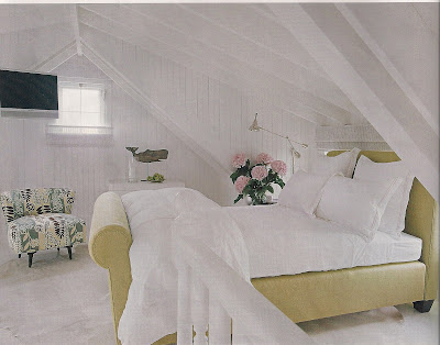
If these walls and ceiling were painted any color but white, I have a feeling they would look like they were starting to cave in! The bed is already in a tight spot- anything darker would have made the room seem a lot smaller. An accent chair adds a bit of pattern and color to the room.

Ahh white on white kitchen bliss!
If you are in the market for some version of “white” paint color, here are some of our favorites:
Sherwin Williams– Dover White and Creamy
Farrow and Ball– Pointing and Slipper Satin
Ben Moore– Arcadia White, Seashell, White Dove, Navajo White, and Featherdown
Ralph Lauren- Whisper, Crescent Moon, and Victorian Lace

